


 If you are not familiar with the amazing body of work created early last century by artists such as Leonetto Cappiello or PAL, you are in for a treat if you search either of their names…or, simply, vintage poster art. During this early golden age of advertising, posters were created to sell consumer products, travel locations, and all manner of transportation. (I often wonder if Don Draper would have liked them ;).)
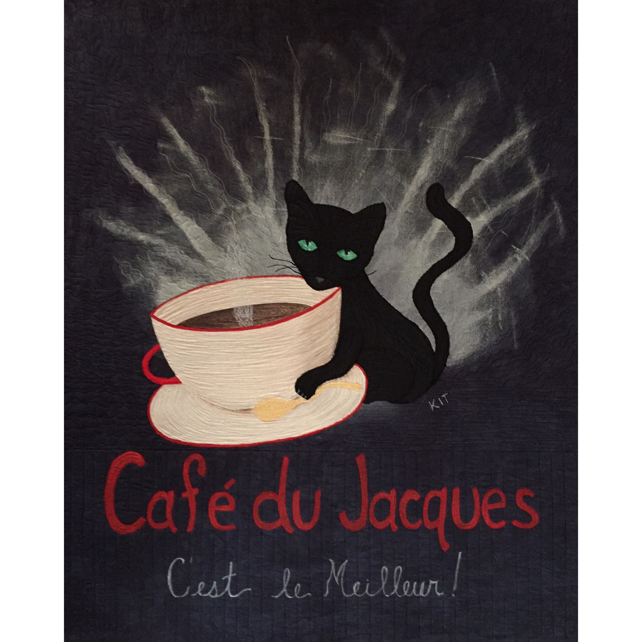
By way of background, my favorite posters are the ones created by Cappiello that feature a few simple strong images that appear to glow against a simple black background. With copyright issues in front of mind, I imagined my own: a super-sized cup of coffee and one of my cats. Many posters of this era depict a kind of backlight behind the product, which inspired me to take a yard of Cherrywood black (very soft in tone and weathered…vintage!…in appearance) and try some fabric paint behind the coffee cup. This glow would enable me to place a black cat next to the cup and still be visible. I even sketched my idea before tearing into my stash ;)…most unlike me.
Bubble, bubble, toil and trouble…I mixed the paints and inks I had on hand, trying for a light champagne-hued shade.

Tested it out on a small piece of the same fabric…so far, so good. Taping a sheet of plastic, then the fabric, I applied the paint. First challenge: not being in my studio for this part of the month, I didn’t have access to most of my supplies. After trying to apply with fingers (not recommended), I found the large brush from Judy Coates Perez’s class (yay!) and did the rest. In retrospect, I should have somehow secured the fabric a bit more…as I ended up with a few marks that I did not intend to make, as the fabric shifted slightly.
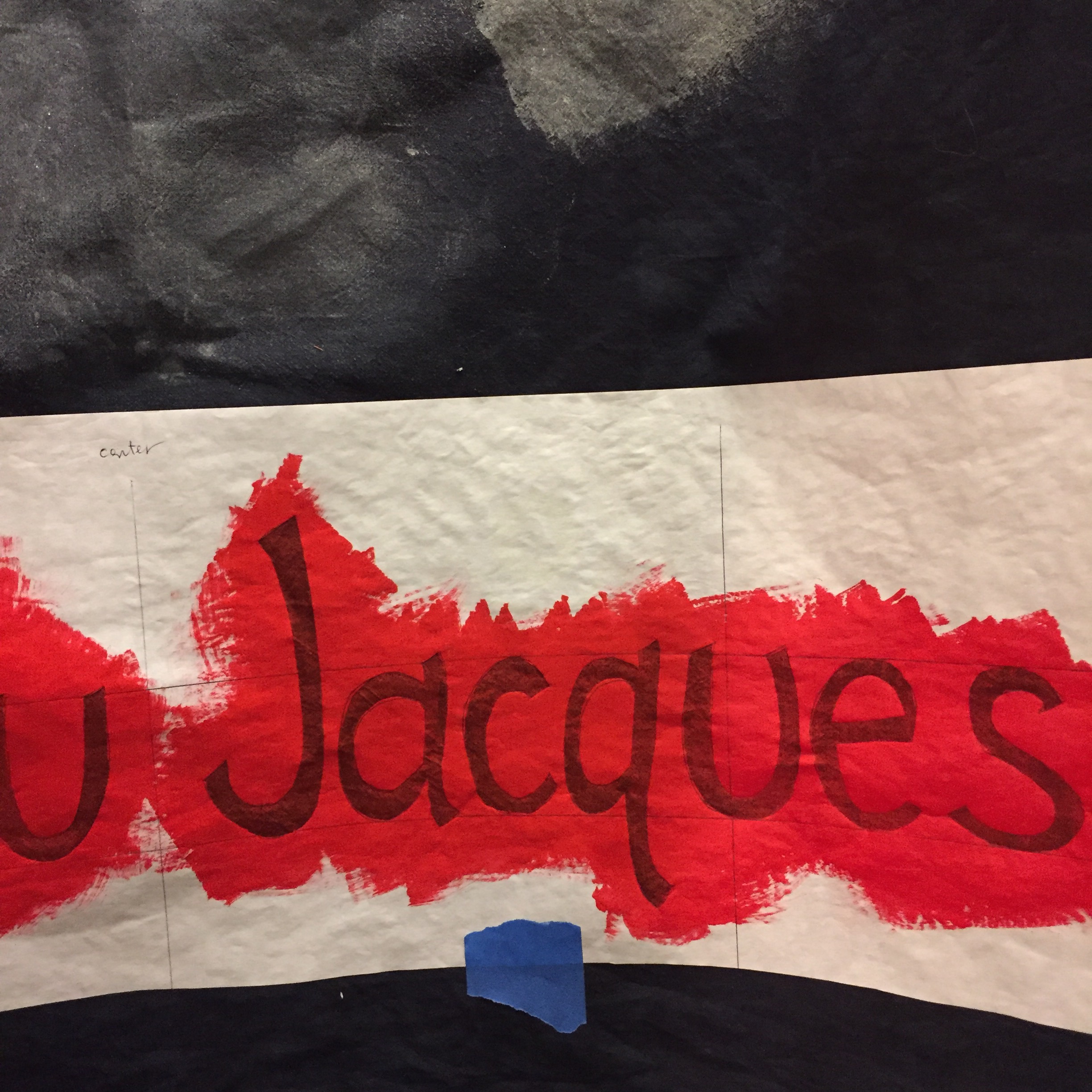
Next step…the lettering for “Cafe du Jacques”! I had red paint on hand, and tried applying it directly to the fabric, as well as on top of gel medium. I liked the slightly worn effect created by direct application (caused by a slight absorption of the paint). Time for a large piece of freezer paper and a lot of patience as I cut out the letters. After ironing the freezer paper to the fabric, it is SO much fun to wield that large brush and apply the paint…the only hard part is waiting for it to dry before peeling off the paper to reveal the letters. This part worked well.
Then, the coffee cup and saucer. I considered every cream-colored fabric in my stash and using a slightly-speckled one on the wrong side looked the best. For fun, I cut a little spoon out of a small piece of gold pleather; it played very nicely with MistyFuse, which was a good surprise as I wasn’t sure.
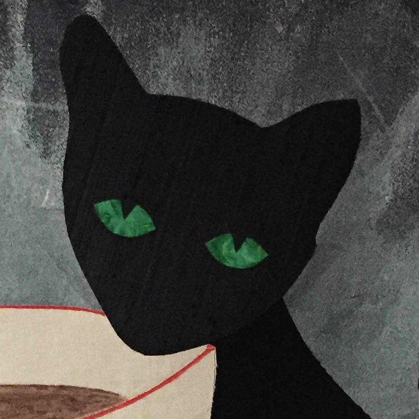
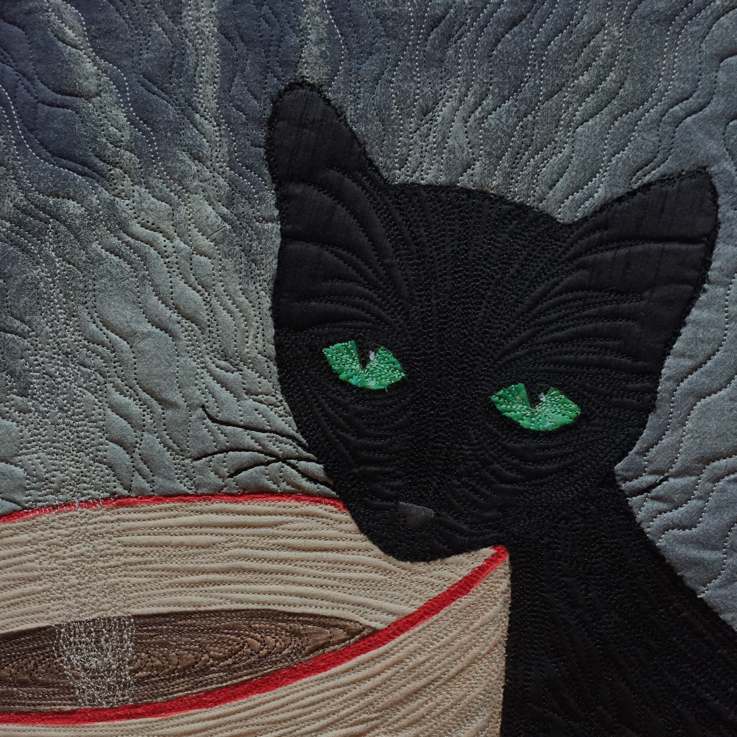
Moving on to Jackson…who, in the spirit of most of the posters in my collection, adopted a French accent and became Jacques…the easy part!! I cut the body parts out from a gorgeous piece of silk dupioni, keeping the grain line in mind vis a vis the direction of his fur. His eyes began with pieces of pre-fused emerald green batik (my usual cat-eye colors did not play nicely with the other colors in this piece), pupils and outlines inked in with my favorite Tsukineko black ink pen.
More ink:
-red around the rim of the cup and saucer (Tsukineko)
-a fine-point silver pen for the “C’est le Meuilleur!” line at the bottom (I used a piece of painter’s tape to mark the line on which to write, marked the center, took a deep breath and summoned my best handwriting ;))
-silver marks on Jackson’s…um, Jacques’s…paw to denote claws
-inside the cup – coffee, of course! “Truffle” by Tsukineko is a terrific coffee color
Ready for the now-repaired long-arm! I like to work on the center first and then stitch outwards…so, cup first (a couple of shades of my favorite polyester thread…then red for the rim and handle), then Jacques (the easy part – just think of how the fur grows and stitch accordingly), then a champagne-y shade to stitch flowing rays behind the coffee cup. I wanted to preserve the soft black background for the viewer, so I stitched most of the rays with smoke-tinted monofilament. I added some heavyweight black silk thread to Jacques’ face…for the first time, the spool pin on my HandiQuilter worked!! My favorite part is the eyes…stitching teeny rays of two-toned green thread to brighten the irises is so much fun and adds a great deal of impact. Also whiskers :)…yes his whiskers are black, which I find pretty cute.
I took a simple approach to the bottom portion of the “poster” — outlining then highlighting the red lettering with a non-shiny red thread, stitching over the silver script with silver metallic (which always behaves beautifully — do not be afraid to try it in your longarm), then adding some simple ruler work in invisible thread to quilt the background.
The “KIT” signature is a tiny tribute to my second-favorite poster artist, Jean Paleontogue, who signed all of his work “PAL.”
Coffee, anyone?


You must be logged in to post a comment.