


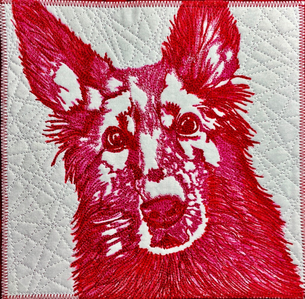
There are few things more fun than looking at “before” and “after” photos of your art quilts. I will readily admit to an addiction to MistyFuse and LOTS of thread. I tend to compose pieces quickly, letting amazing hand-dyed fabric backgrounds do a lot of the heavy lifting, and as soon as pieces are fused the quilt goes onto the longarm. (Quilt police, come and get me ;)). The importance of threadwork is self-evident for my animals, but it plays a very important part in other components of my pieces.
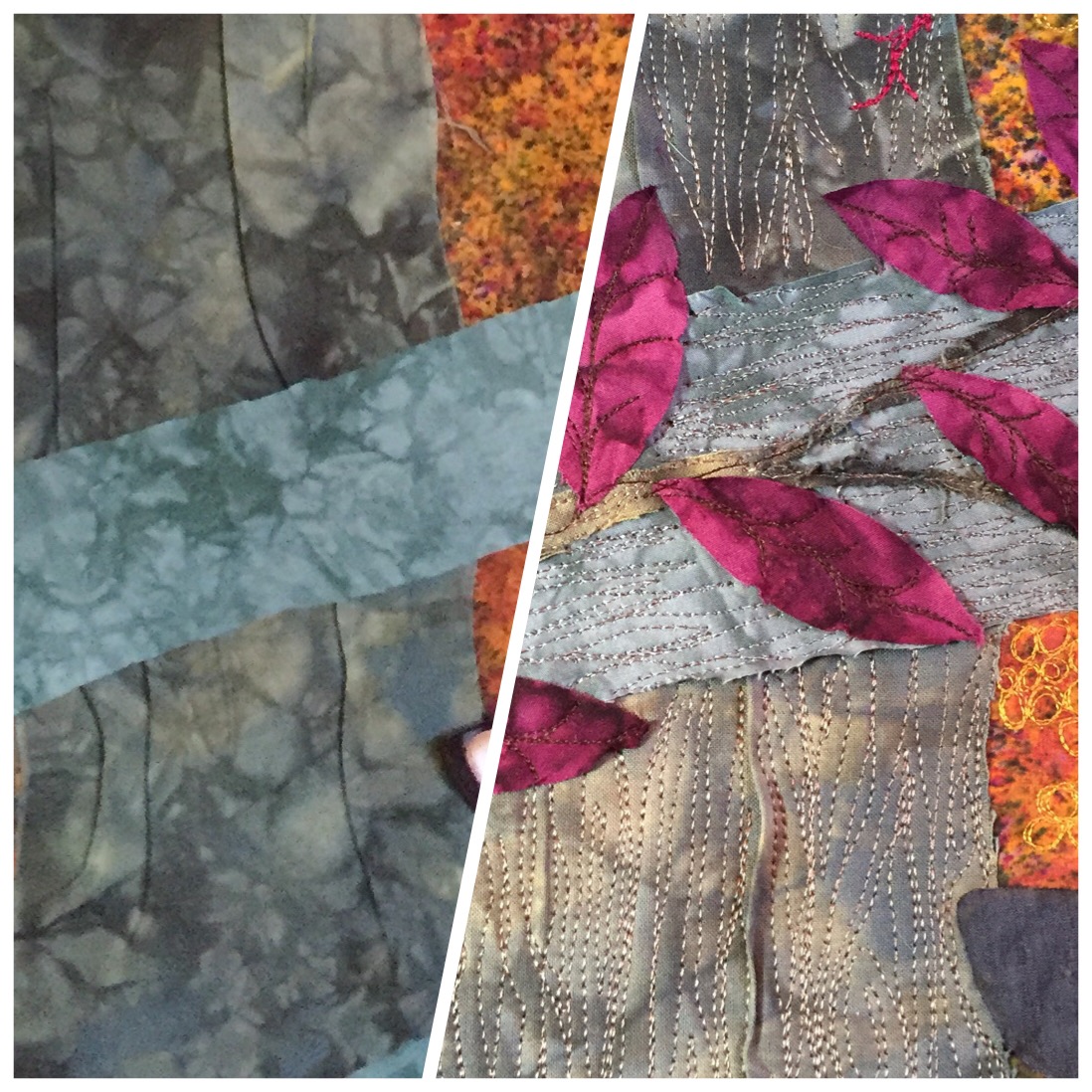
The photo above is a great example! The “tree trunk” and “fence rails” are fabric strips literally ripped and placed on the background. One of the many great things about MistyFuse is its forgiving quality as I reposition pieces…and, in the case of the tree trunk, sculpt ridges to simulate bark. A great deal of two-toned thread was then applied to suggest the lines and rings on the tree – tremendous fun. More depth can be added by lightly fusing, then only partially stitching, organic elements such as leaves, which appear to ripple. (Super-tight weave batik is helpful here.) Finally, remember the ripped edges? Using a seam ripper to remove loose threads and exposing a (controlled) frayed edge adds another element. A lovely backdrop for our little friend (c’mon, you didn’t really think you were going to get away without a cat picture, did you?)

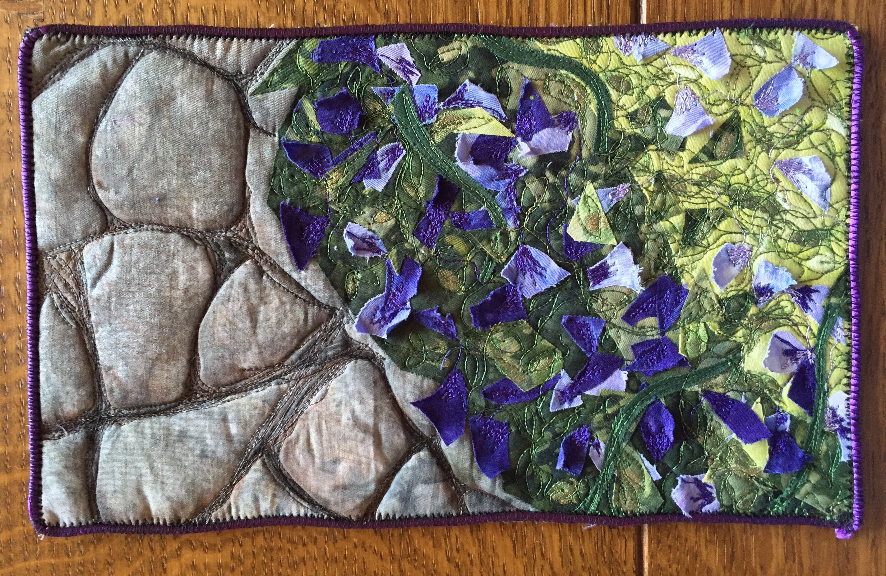
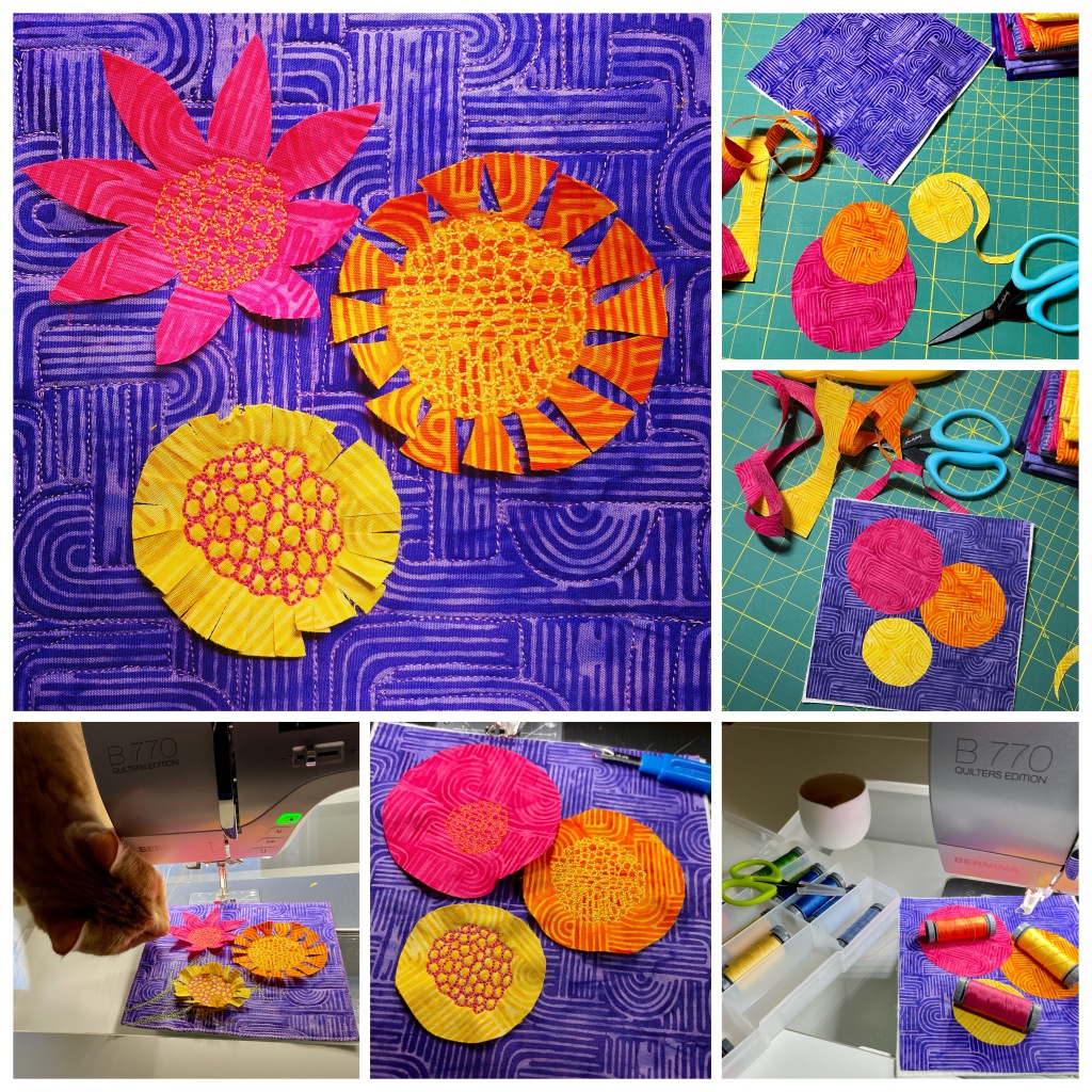
Another weapon in the texture arsenal is batting. For this very small piece for a trunk show, I wanted to bring the stones and flower petals into relief…so I used wool batting. By carving “cracks” into the “rock” face, pockets of the very high loft batting were trapped and popped up. As in my forest scene, I stitched only part of the petals and lifted the tips up with a seam ripper after stitching.

This small quilt was the rare exception to my practice of fusing all layers together (it makes life much easier when you take your piece to your Bernina)…I didn’t want to take a chance of flattening the wool batting.
It is difficult to see in these photos, but another very important tool is acrylic ink. You know that you’ve taken a class with Judy Coates Perez when you are compelled to do this before composing your piece ;):
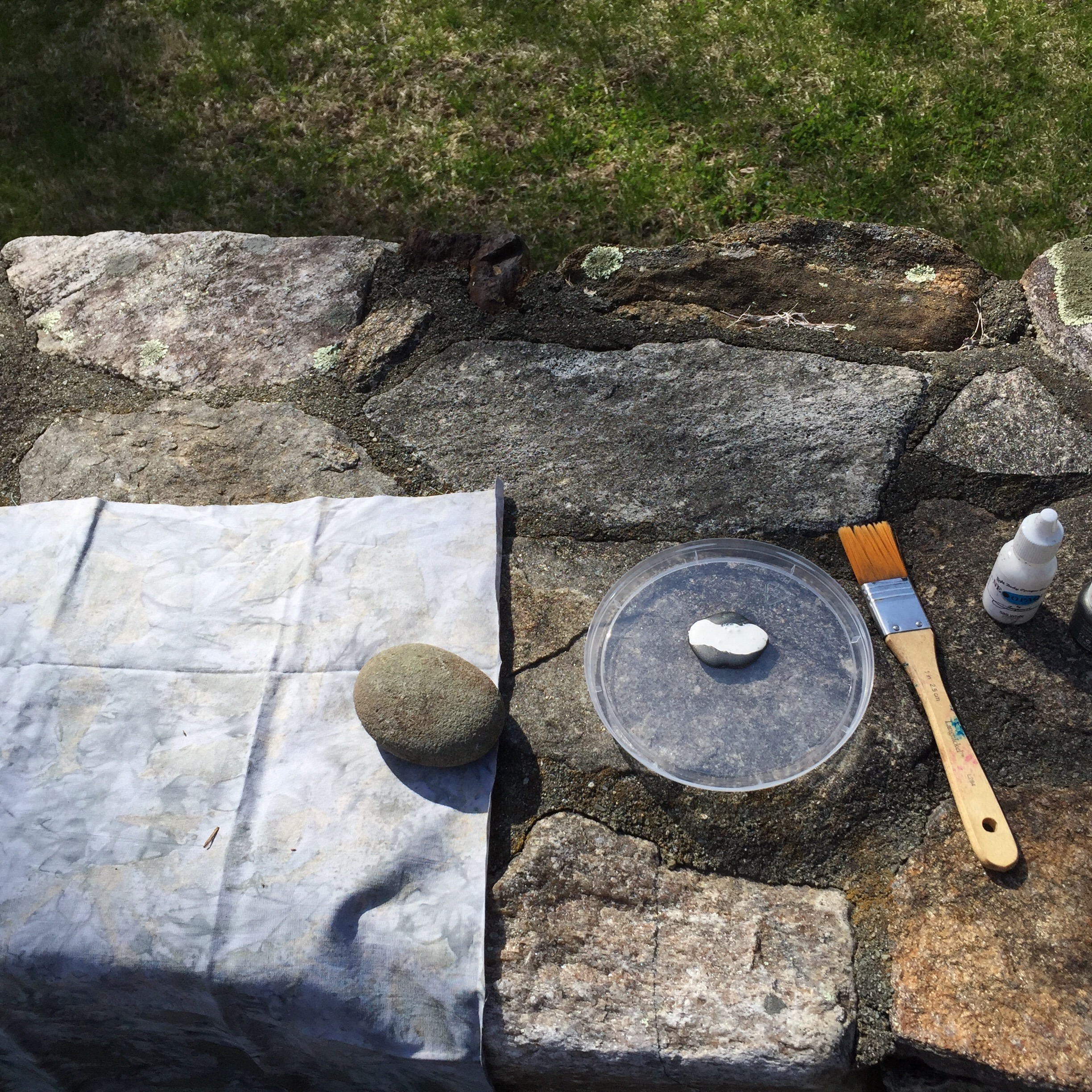
Brushing metallic grey ink unevenly onto the background fabric, using the actual stones as the underlying surface, gave the fabric another (in this case, very subtle) layer of texture.
How do you add dimension and texture to your pieces?


3 responses to “Adding Texture to Your Art”
WOW! I gotta try this now! I confess that I hadn’t seen the folds in your comparison picture before (I was too focused on the cat’s eyes). Thanks for suggesting another technique. And now to find a class taught by Judy Coates Perez…
Oh Judy is an AMAZING teacher. I took a 1-day class in Houston last year, look for it as soon as IQF releases the class schedule. (It was 2 days of content in 1 day !)
Sally, I’ll go w/you!